 Color-coded bar chart from an October 18, 2006 White House briefing on Iraq by the U.S. Central Command. From New York Times
This is just too good to post. This is off The New York Times:
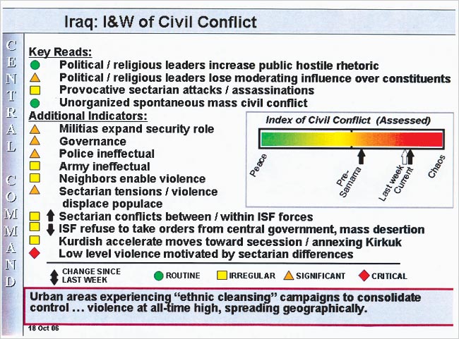
WASHINGTON, Oct. 30 — A classified briefing prepared two weeks ago by the United States Central Command portrays Iraq as edging toward chaos, in a chart that the military is using as a barometer of civil conflict.
A one-page slide shown at the Oct. 18 briefing provides a rare glimpse into how the military command that oversees the war is trying to track its trajectory, particularly in terms of sectarian fighting.
The slide includes a color-coded bar chart that is used to illustrate an “Index of Civil Conflict.” It shows a sharp escalation in sectarian violence since the bombing of a Shiite shrine in Samarra in February, and tracks a further worsening this month despite a concerted American push to tamp down the violence in Baghdad.
In fashioning the index, the military is weighing factors like the ineffectual Iraqi police and the dwindling influence of moderate religious and political figures, rather than more traditional military measures such as the enemy’s fighting strength and the control of territory.
The conclusions the Central Command has drawn from these trends are not encouraging, according to a copy of the slide that was obtained by The New York Times. The slide shows Iraq as moving sharply away from “peace,” an ideal on the far left side of the chart, to a point much closer to the right side of the spectrum, a red zone marked “chaos.” As depicted in the command’s chart, the needle has been moving steadily toward the far right of the chart.
An intelligence summary at the bottom of the slide reads “urban areas experiencing ‘ethnic cleansing’ campaigns to consolidate control” and “violence at all-time high, spreading geographically.” According to a Central Command official, the index on civil strife has been a staple of internal command briefings for most of this year. The analysis was prepared by the command’s intelligence directorate, which is overseen by Brig. Gen. John M. Custer.
You have got to love the little color-coded slide here--this is classic! Green is peace--Red is chaos! Even if you don't bother reading the summary below, you can clearly see that Iraq is a complete disaster. And it is even sliding closer to chaos, as noted between last week's transparent arrow, and the current black arrow on the slide. According to the Times:
In the Oct. 18 brief, the index moved still another notch toward “chaos.” That briefing was prepared three days before General Abizaid met in Washington with President Bush, Defense Secretary Donald H. Rumsfeld and Gen. Peter Pace, the chairman of the Joint Chiefs of Staff, to take stock of the situation in Iraq.
So the slide was seen by both President Bush and Defense secretary Rumsfeld. I do have to wonder what the president's reaction was when first viewing the slide--did he understand the implications of what that slide was telling him? Did he understand the direction the arrow was moving?
And how is the Bush White House responding to this new revelation? Here's a Yahoo News story saying the Bush administration dismisses this slide:
WASHINGTON (AFP) - The White House dismissed a leaked military chart that shows Iraq sliding toward "chaos" as an outdated snapshot of sectarian violence at the height of Ramadan that has since dropped sharply.
[....]
"That was a snapshot taken at the height of the Ramadan violence," said Tony Snow, the White House spokesman.
"If you got the same report last week, you would have found out the national sectarian incidents from the 21st to the 27th dropped 23 percent; casualties nationwide dropped 23 percent; incidents of sectarian violence in Baghdad dropped 23 percent; sectarian killings in Baghdad dropped 41 percent," he said.
Pentagon press secretary Eric Ruff said it was "really regrettable that slides of secret or classified materials manage to get out."
Okay Mr. Snow, if this is just a snapshot of the conditions in Iraq at that time of the October 18th briefing, then could the Bush administration please produce a slide with the same color-coded bar chart showing the current situation in Iraq today? That way, we can see whether the arrow is continuing to slide towards the red side, or is the arrow sliding towards the green side?
Because at this point, it appears the arrow is sliding towards the red side.


No comments:
Post a Comment