 Graph is from St. Louis Federal Reserve
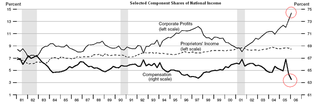
I found this graph off The Daily Kos, and even I was surprised by it. The graph shows the percentage of national income that is going to corporate profits, proprietor's income, and compensation (wages). The source of the graph is from the St. Louis Federal Reserve, and also from The Big Picture.
Just look at that gap between corporate profits and wages.
This is from yesterday's edition of The New York Times:
The median hourly wage for American workers has declined 2 percent since 2003, after factoring in inflation. The drop has been especially notable, economists say, because productivity--the amount that an average worker produces in an hour and the basic wellspring of a nation'’s living standards--has risen steadily over the same period.
As a result, wages and salaries now make up the lowest share of the nation'’s gross domestic product since the government began recording the data in 1947, while corporate profits have climbed to their highest share since the 1960’s. UBS, the investment bank, recently described the current period as "“the golden era of profitability."
Until the last year, stagnating wages were somewhat offset by the rising value of benefits, especially health insurance, which caused overall compensation for most Americans to continue increasing. Since last summer, however, the value of workers'’ benefits has also failed to keep pace with inflation, according to government data.
At the very top of the income spectrum, many workers have continued to receive raises that outpace inflation, and the gains have been large enough to keep average income and consumer spending rising.
And here is my previous posting on the Times article.


No comments:
Post a Comment